

With stock markets – and most share prices – well off their highs, there’s plenty of historical data to suggest that now is an excellent time to invest. That’s because bull markets always follow bear markets. Thus, investors who buy shares in high quality companies today will not only benefit from the earnings growth produced by these businesses, but also from their re-rating to higher price-to-earnings ratios when markets recover.
Over three decades I have seen the chart produced in Figure 1. at various market extremities. Today it appeared again courtesy of the macroeconomic research firm Alpine Macro. It reinforces the message we believe investors should heed – the time to be greedy is when everyone else is fearful.
The histograms in Figure 1. reveal 150 years of annual returns for both U.S. bonds and stocks – as measured by the annual total returns for U.S. 10-year treasuries and the S&P500 since 1872. Figure 1. also shows this year’s returns (in red) have fallen into the far-left tail of the return distribution. The chart has a reliable habit of being an effective indication of mean reversion. The timing can’t be foretold by Figure 1. of course, or by any other means, but it shows that years in which the market falls by as much as it has recently are rare, and better returns than these are highly likely, indeed probable, in the future.
Figure 1. Distribution of annual returns in U.S. S&P500 and 10-year bonds to 28 October 2022
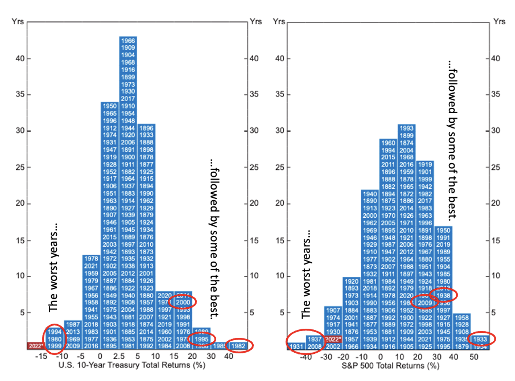
Source: Alpine Macro / Montgomery Investment Management
By way of example, take the worst year for equities – 1931, when the market fell by more than 40 per cent. The following year the market fell again, but by less than ten per cent. The year after that, however – 1933 – was one of the two best years for equities since 1872, with the market rising by more than 50 per cent.
The year 2008 was one of the two second-worst years for equities and it was followed, in 2009, with returns of 20-30 per cent. By way of another example, 1937 was the other second-worst year for equity performance, generating a return of negative 30-40 per cent. It was followed by 1938, which generated a return of +30-40 per cent.
Of course, there are caveats to producing the chart at the beginning of November and comparing the returns to those of fully concluded years, and that is we aren’t comparing like with like. It could be that a chart taken mid-way, or ten-twelfths of the way, through all the previous years produces a different-looking distribution, and the current year may not be at the extreme left. But I suspect the picture wouldn’t significantly alter the argument.
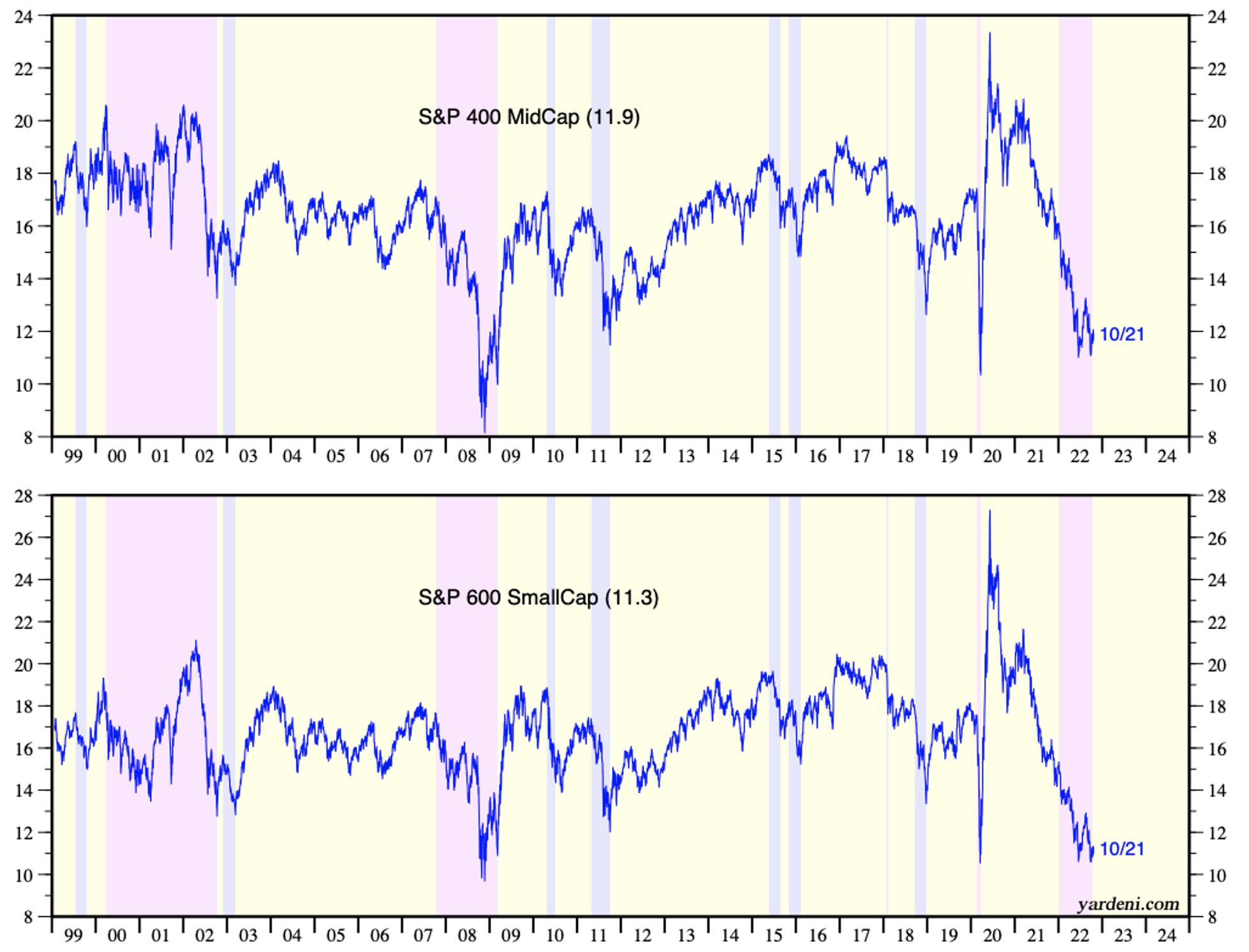
Indeed, elsewhere here at the blog, we have shown aggregate P/E ratios, for small-cap stocks in particular, are indeed at historic intra-year extremes. We do so here again.
Figure 2. shows the P/E ratio for the S&P600 Small Cap index is approximately the lowest it has been in a quarter century. If P/E ratios are the pulse of stock market popularity, sentiment is clearly as low as during the Global Financial Crisis and lower than the COVID-19-inspired sell-off.
Figure 2. P/E ratios for U.S. small and mid-cap stocks as at October 31, 2022
And given where P/E ratios are today, there is a genuine possibility investors who purchase shares in high-quality growth companies today will not only benefit from the earnings growth produced by their selections but also the re-rating, at some point in the future, to higher P/E ratios.
To clarify, by this I mean to point out that if you purchase, on a P/E of 10 times earnings, the shares of a company growing its earnings by 15 per cent per year, your return will be the same as the earnings growth rate (in this case 15 per cent) if you sell the shares at a future date at the same P/E ratio (10) as when they were purchased (See Table 1.). If, however, the P/E ratio rises in the future, for example because investing in the stock market has become popular again, your return will be higher than 15 per cent.
Table 1. Follow the numbers: at constant P/E ratios, investors’ return equals the EPS growth rate
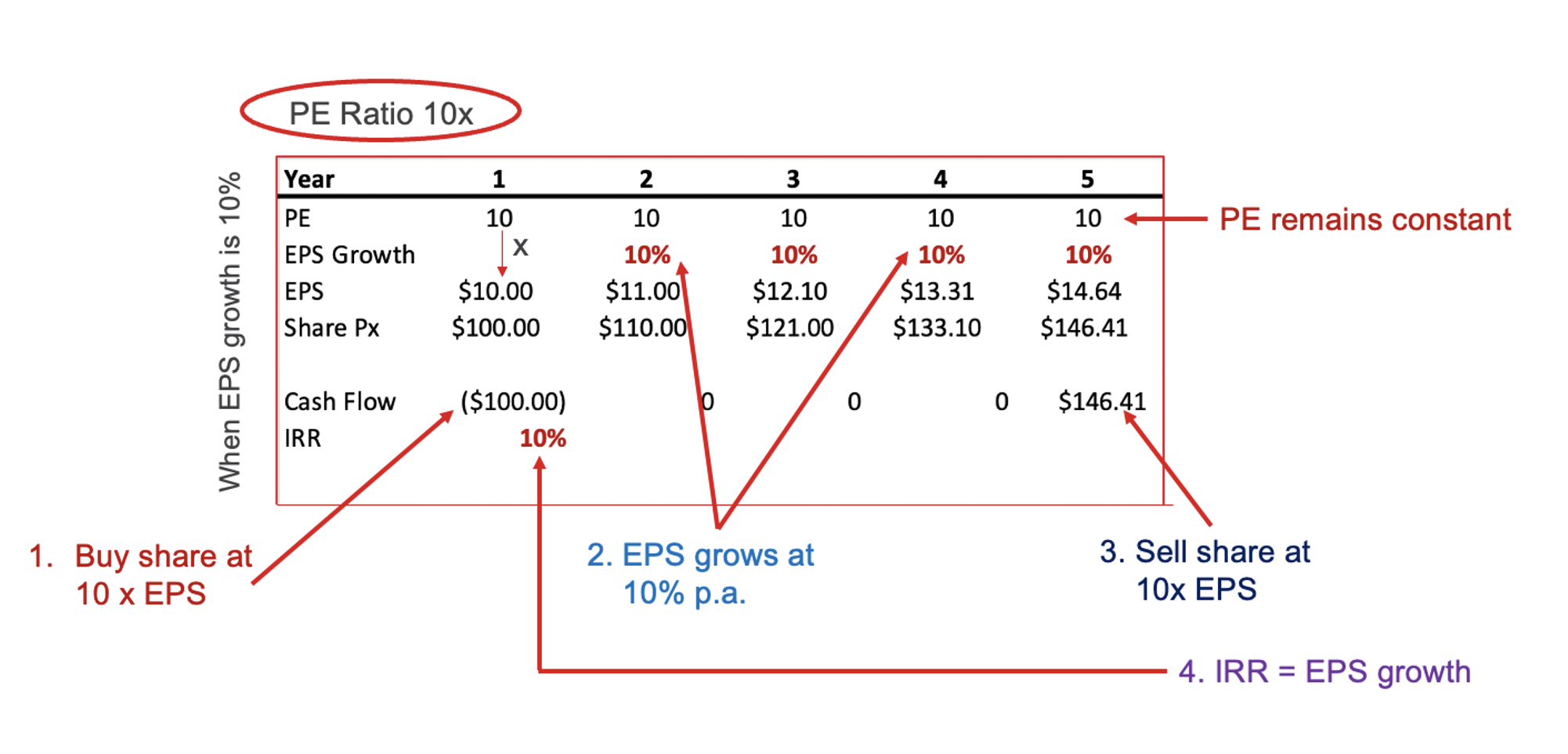
Source: Montgomery Investment Management
Returning to Figure 1., bell curves help to inform probabilities, and the appearance of both bond and stock returns for this year, at the far left of the tail, suggests the odds are improving, if not high, for better returns in coming years.
For those who are beginning their investment journey, for example, the young or those preparing for retirement, one of the scariest risks is the one known as ‘sequencing risk’. Sequencing risk is the risk that large losses occur in early years, particularly the first year, having a detrimental impact on overall results.
Indeed, the investing axiom ‘the lower the price you pay, the higher your return’, is reinforced by the message painted by both Figures 1. and 2. That is, at least historically, when sentiment is this glum, investors are rewarded for going against consensus.
Finally, Figure 3. provides further evidence in history for gaining some comfort investing now.
As Figure 3. demonstrates, bull markets always follow bear markets and they have tended to produce higher returns on average and have run for much longer than their bear market counterparts.
Figure 3. Bull markets versus bear markets through history
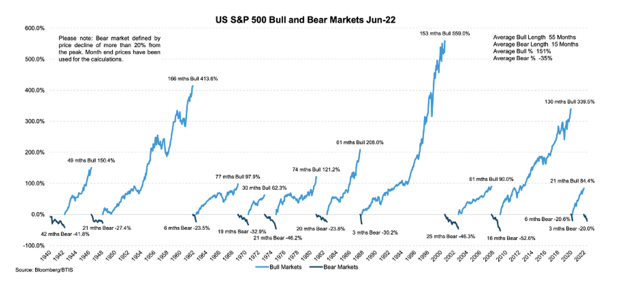
Clearly, nobody can consistently nor reliably ‘time’ the bottom of the market, and it is possible the market may yet fall further (if hypothetically, China invaded Taiwan, all markets would slump). That risk aside, all three charts and Table 1., reveal there is some wisdom in beginning one’s investment journey today, or adding to one’s investments today, for the long-term.
Eventually, indiscriminate selling gives way to discernment. Quality wins out and history shows good returns years follow years of poor returns. Standing on the sidelines may be a regrettable and costly error.